
Typography is basically a technique of arranging type. Every designer must learn it. They must learn to use the colour scheme, typeface, and layout to achieve the desired results.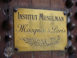 Continue reading
Tag Archives: typography
More Typefaces for Engraving
Another selection of suitable typefaces for engraving trophies and plaques
As we said in the first part, a well thought out typeface speaks volumes about your company’s image. Context as well as clarity is another aspect, and this is profound with engraving and etching. Here’s another selection of ‘must-use’ typefaces. This time, we are focusing on serif typography.
Suitable Typefaces for Engraving
Our look at suitable typefaces used for engraving trophies and plaques
Your chosen typeface says a lot about your company’s corporate image. For example, the Design Research Unit’s Rail Alphabet screams ‘British Rail’ – even in an age where individual rail franchises choose their own typefaces. You expect to see a sombre though classy typeface for a funeral directors’ business (Comic Sans MS will never do). From the smallest of startups to the mightiest of multinationals, clear typography is everything.
With all the typefaces we can download, free and paid-for, we could go crazy and play with decorative fonts. Sometimes, less is more; with engraving and etching, clarity matters. Here’s our selection of ‘must-use’ typefaces, starting with Sans-Serif typography.
Part One: Sans-Serif
Arial
Microsoft’s Arial Bold is one of the best-known, and most widely, distributed typefaces on any computer system. Created in 1982 by Robin Nicholas and Patricia Saunders, the Arial family has subtle differences to similar sans-serif fonts, which is why it can be mistaken for similar typefaces like Helvetica Bold or Univers Bold.
Best for: direction signs, room numbers, and plaques.
Helvetica Bold/Helvetica Black
Max Miedinger’s most famous font family was created in 1957 and – like Arial – has its roots in the earlier Akzidenz-Grotesk typeface. It is an excellent all-round typeface for publicity materials but its use in the world of engraving makes for clear lettering that can be read from a distance. It has inspired a fair number of similar typefaces like the Rail Alphabet, Frutiger, and to some extent, Jock Kinnear’s and Margaret Calvert’s Transport typeface (which you see on today’s road signs).
Best for: direction signs, room numbers, and plaques.
Roboto
If you have an Android-powered smartphone or digital tablet, you may come across this font on a daily basis. Christian Robertson’s Roboto typeface was designed in 2012 for Google’s devices. It is also free to download and makes for a good alternative to Arial and Helvetica. Roboto Bold and Roboto Black typefaces are good for signage whereas the regular Roboto font is suitable for engraving onto trophies. Roboto Black and Roboto Bold Condensed is suitable for headlines.
Best for: direction signs, room numbers, plaques, and headlines (Roboto Black/Bold Condensed).
Helvetica Compressed/Futura II Extra Bold
For the best part of 50 years, the Helvetica Compressed and Futura II Extra Bold typefaces have been a popular choice for newspaper headline text. Owing to their striking nature, they are suitable for being read from a great distance.
Best for: signage and headlines.
ITC Avant Garde
Created between 1970 and 1977, Ed Benguiat’s Avant Garde font family was never committed to hard type (which, in other words, means we didn’t see the typeface in metal type form). Starting out as a phototypesetting based face, it was a popular choice from the late 1970s to the early 1980s. The Medium, Demi Bold, and Bold weights are suitable for signage whereas the Book and Medium variants are suitable for engraving trophies.
Best for: direction signs, room numbers, and plaques.
In Part Two…
For the second part, we shall be looking at serif typefaces and mulling over which ones would be suitable for engraving work.
Able Engraving, 26 September 2016.