
Another selection of suitable typefaces for engraving trophies and plaques
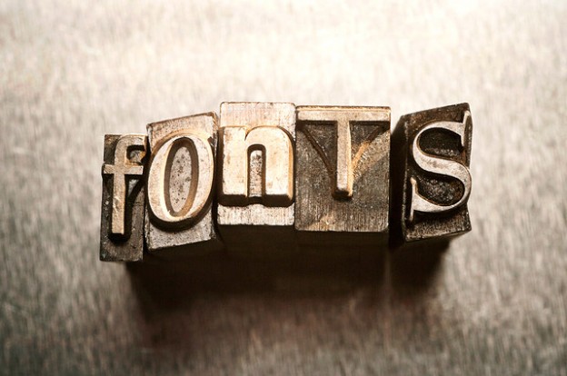
As we said in the first part, a well thought out typeface speaks volumes about your company’s image. Context as well as clarity is another aspect, and this is profound with engraving and etching. Here’s another selection of ‘must-use’ typefaces. This time, we are focusing on serif typography.
Part Two: Serif Typefaces
Times Roman/Times New Roman
As famous as (or infamous if you prefer) Comic Sans MS, the Times Roman/Times New Roman is associated with the newspaper that gives the typefaces their name. It is formal yet clear, especially for trophies and signage. In less weighty forms, it is ideal for body text; in bold and italic forms, great for banners. The Times Roman family of typefaces were designed by Victor Lardent and Stanley Morison for The Times newspaper in 1931, and used a year later.
Best for: information signs, trophies, and plaques.
Goudy Catalog/Goudy Old Style
The Goudy typefaces designed by Frederic Goudy are a suitable alternative to Times Roman. They also predate its more famous typographical cousin by sixteen years (1915). Since Mr. Goudy’s original designs, there have been variants created by Morris Fuller Benton (for example, Goudy Catalog, 1919). In Goudy Catalog, it comes into its own for informative text. Goudy Bold is good for banners, whereas decorative engraving work is suited to Goudy Handtooled.
Best for: information signs, trophies, and plaques.
Clarendon
A slab-serif typeface, the Clarendon family of typefaces designed by Robert Besley date from 1845. When intellectual property law and cryptography were in their infancy, it was the first typeface to have been patented. It is a popular here type for display material and signage. From 1968 to 1990, it was synonymous with Granada Television’s on-screen graphics. It is a popular choice for newspaper headlines.
Best for: direction signs, signage, and headlines.
Optima Black
The Optima Black typeface is a very good alternative to Times Roman. Created by Hermann Zapf (also of Zapf Dingbats symbols fame) in Germany, it is best used on trophies and signage. Inspired by Roman-era and Roman style lettering, Mr. Zapf’s original name was New Roman. Instead, the marketing staff insisted on Optima. With Times Roman, and Times New Roman, graphic designers would have been confused if Hermann had his own way.
Best for: signage and trophies.
Souvenir
Seen as a 1970s typeface (due to its ubiquity in the aforementioned decade), the Souvenir family of typefaces date from 1914. The original version was created by Morris Fuller Benton and used for headers and body text. Ed Benguiat’s revival of the type in the early 1970s saw the addition of thicker and thinner weights. The thicker weights were seen on posters and album covers at the time, and it gained the same sort of reputation that Comic Sans MS has today. In its thickest form, Souvenir is very good for banners and signage. The thinner weights make for a friendlier body text type, suited to fine engraving work.
Best for: direction signs, trophies (thinner weights), and plaques.
Any other suggestions…?
If you have enjoyed our two-part look at typefaces, feel free to add a few more suitable ones to our lists. Any comments on our suggested typefaces are appreciated.
Able Engraving, 07 October 2016.