
Typography is basically a technique of arranging type. Every designer must learn it. They must learn to use the colour scheme, typeface, and layout to achieve the desired results.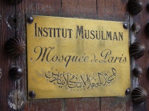
Designing is about much more than just making legible words. Poor typographical choices may affect the quality of your sign. It may take away the whole point of your sign. The following are some of the most important considerations when engraving.
Legibility
There is no point of making a sign if no one can understand it. Legibility makes it possible for your clients and other businesses to understand your graphic or sign. The fonts should be made in the right size and style. If they are too small or too fancy, it may be difficult for others to understand. Your choice of typography should match your needs. Designing your font is a long process. Craftspeople need some time to create typefaces. The best designers use fonts in a variety of styles and weights to achieve your desired results.
Measure
Measure is a term used to explain how wide a text block is. Your designer has to get the measure right to help you get the best reading experience. If you have lines that are too long, it is easy to get lost while reading. If they are too short, reading breaks up unnecessarily.
Hierarchy and Scale
Your designer must be able to help your readers determine which information is important. They can do this by making adjustments to the layout. Titles, for example, are usually made in bigger fonts than the rest of the information. Other ways to achieve hierarchy include spacing and colour. Resist the urge to over-use all-capital letters even though it seems like the most effective way to communicate urgency. Use of all-caps may be appropriate for short sentences and words but it is not suitable for longer messages. You may use it for signs such as ‘DANGER’ and ‘CAUTION.’ Use of all-caps in longer sentences may distort its distinctive shape. It seems like a long, shapeless stream. It may also be irritating since it seems like the print version of yelling.
Typeface
Typeface is very important when you want to engrave. There are three major types of typeface; Serif, Script, and Sans Serif. Serif font is mostly used for large bodies of text. Its little effects are easy on the eye and they make it easy to distinguish one letter from the other. Sans Serif appears more serious as it lacks the serif fonts. It is, therefore, suitable for use on headlines. Its appearance is very simple so it stands out. Script looks like hand-lettered writings made using a pen, pencil, or brush. It should be used on small parts of a text to add elegance and some decorative value. Using too much of script can take attention away from the message.
If you need help with engraving in the UK, contact Able Engraving & Design Ltd. Our engraving services are professional and affordable. They include traffolyte, brass, stainless steel and more. Our specialists work in and around London, Sussex, Kent, and Surrey. We can help you come up with high-quality signs, memorial plaques, rating plates, and commemorative plaques in the materials of your choice. They make engraved signs using high-quality equipment and modern technology.