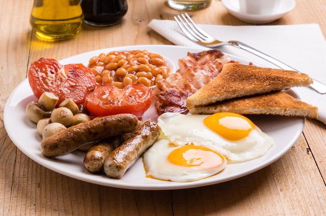
Second most popular design idea for new Pound coin was a full English breakfast

Bad for circulation? The tails side of our new Pound coin could have been a traditional fry-up. Image by Felix Furo (via Shutterstock).
A case of bacon bad or foreseeable circulation issues? In a recent competition to design the new look Pound coin, the second placed design idea was a full English breakfast. According to The Times newspaper, the Royal Mint’s Chief Engraver, Gordon Summers, received over 6,000 entries. Besides the winning design, there was some 30 to 40 distinct subject areas. The Great British Breakfast featured prominently.
Furthermore, the breakfast based designs were ruled out on a main technicality. That any design had to be representative of the four nations which make up the United Kingdom. What may be a fry-up in Fareham may differ from one in Falkirk, by subtle means of the ingredients (for example: white or black pudding, or potato cakes).
What would have happened if the tails end of the Pound coin had a full English on the reverse? Perhaps there might have been some Boaty McBoatface style back pedalling from the Royal Mint. Plus a similar level of annoyance akin to that episode.
In the end, it was David Pearce’s design that won the day with the Royal Mint. The fifteen-year-old from Walsall opt for a simple yet effective design. That of a rose, leek, thistle and a shamrock emerging from a Royal Coronet (Backclinics). Representing, of course, the four nations (England, Wales, Scotland, and Northern Ireland in that order).
We at Able Engraving and Design think David’s design is simple and works well on the tails end of the new Pound coin. The first ones will be launched on the 28 March this year.
Able Engraving and Design, 08 March 2017.

